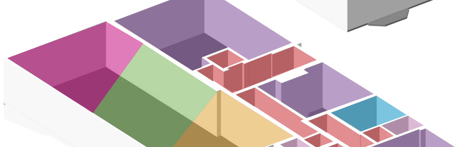
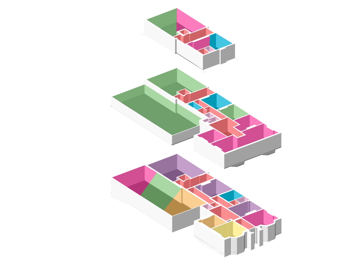
I have revised my programme now that I have changed some rooms around.
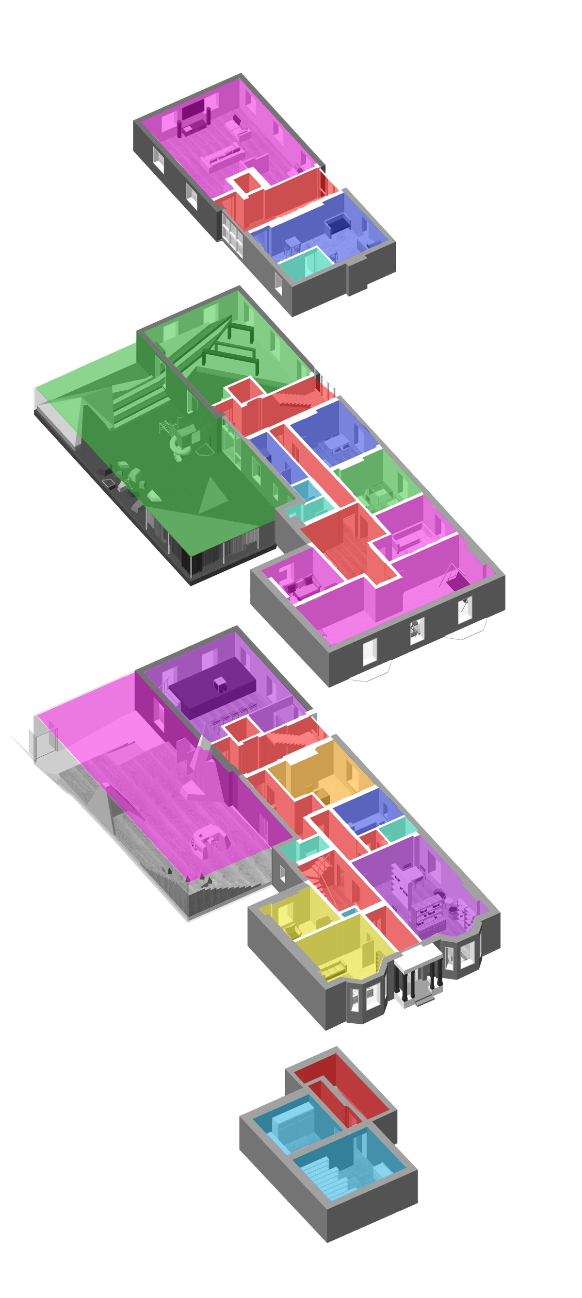
Pink – Relax
Purple – Activities
Dark Blue – Food
Green – Play
Yellow – Councilling
Orange – Admin
Aqua – WC
Light Blue – Storage
Red – Corridors
InteriorDesignWorld

I have revised my programme now that I have changed some rooms around.
Pink – Relax
Purple – Activities
Dark Blue – Food
Green – Play
Yellow – Councilling
Orange – Admin
Aqua – WC
Light Blue – Storage
Red – Corridors
After talking through my design with my lecturer I decided I needed another counselling room and I was wasting a room at the front of the ground floor so I’ve had a bit of a change around of rooms and functions.
I have knocked down a wall to make one big room for my library/classroom area. I now have two counselling rooms, one larger and one smaller and more intimate.
I am pleased with these chances and think it really improves my design.
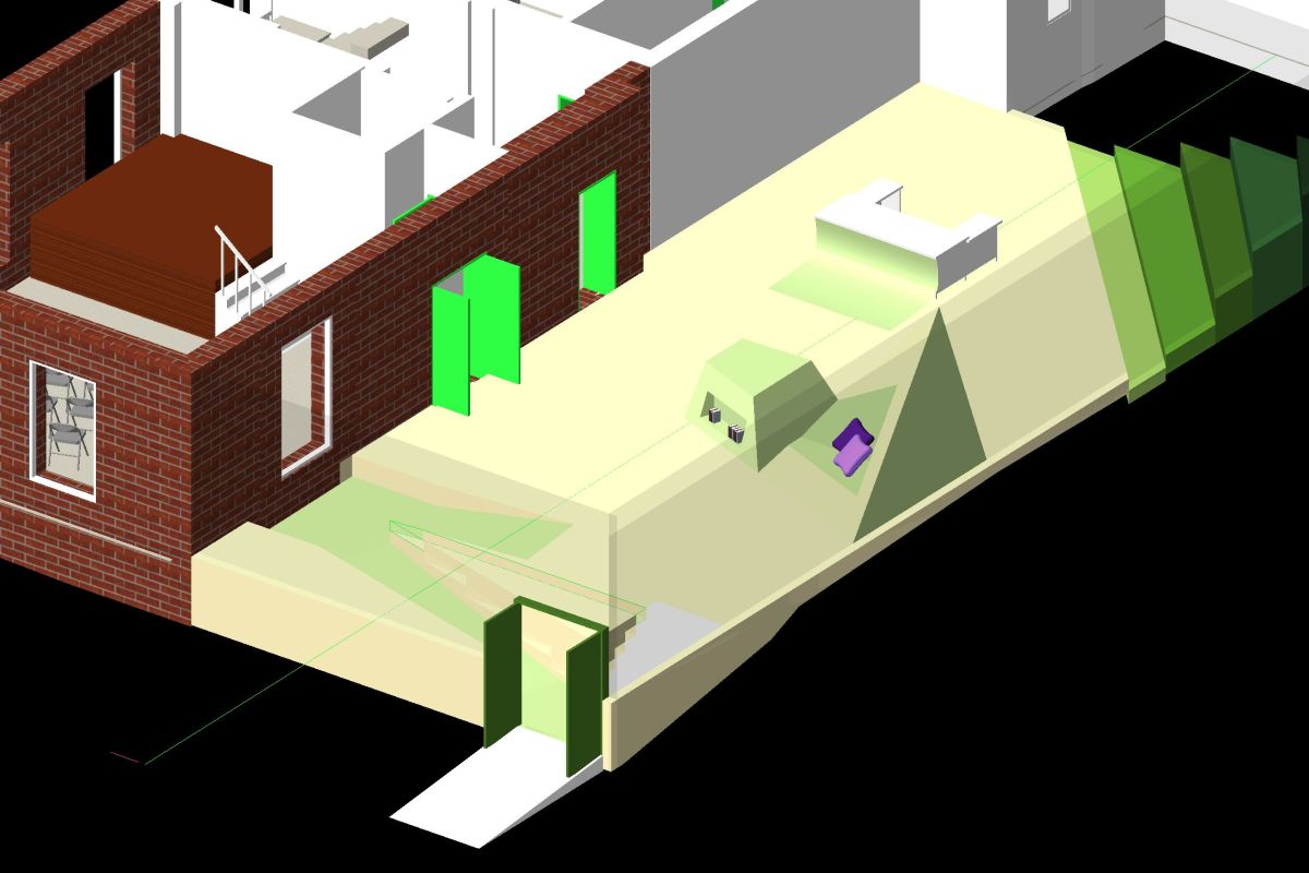
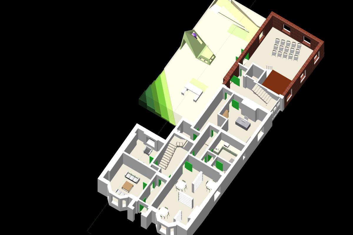
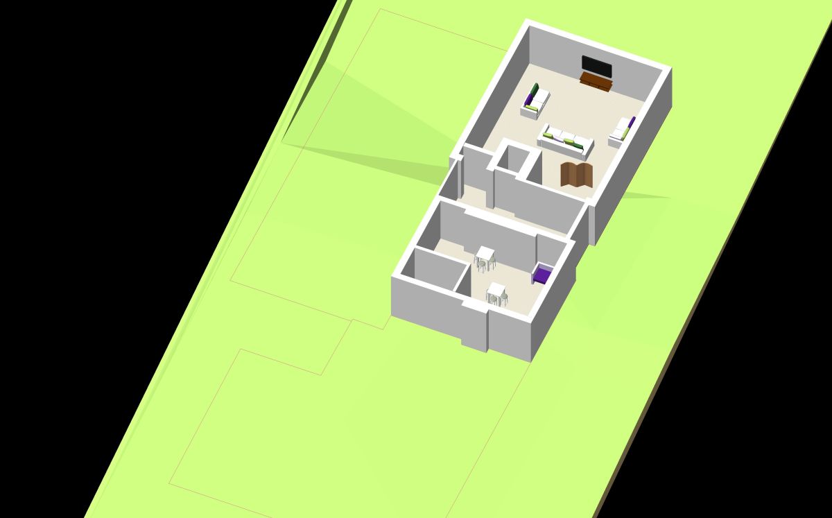
This is the newest version of the downstairs of my extension building. It is the entrance to the building so it needs a reception desk and I want it to be a nice social space so there is seating and an information table. I am not overly happy with this layout as it seems a bit spread out and doesn’t seem to flow very well, but I am happy with the progress.

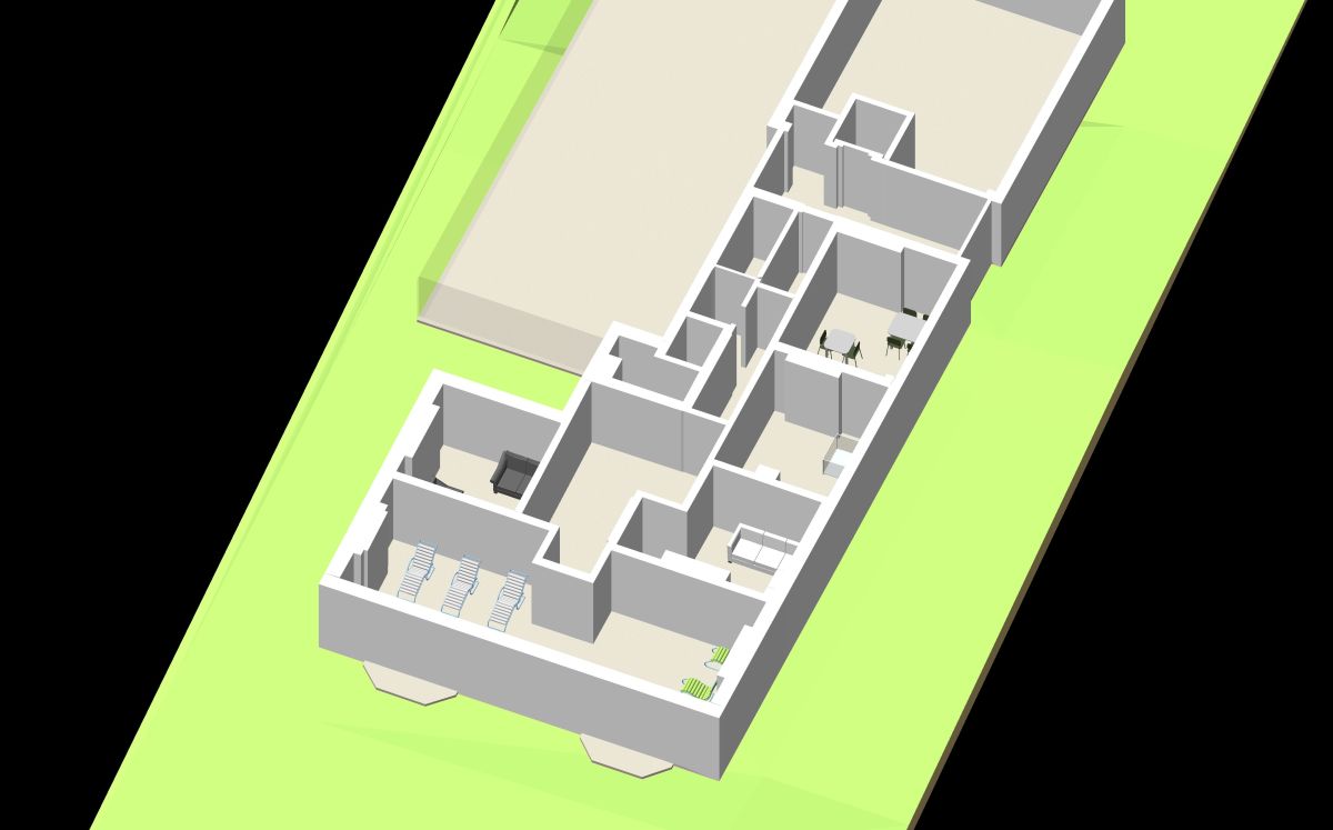
I started filling in the furniture in the rooms of my building. Making sure the rooms have enough space for the intended use and starting to come up with a scheme/theme for the building.
I am trying to stick to a limited coloured pallet. I am using white, grey and wood as my main colours and only using greens and purples at the moment. However this isn’t a definite decision yet.

OB Kindergarten, designed by Japanese architectural firm HIBINOSEKKEI, was fully designed at a child’s-eye view. They wanted to encourage children to move around as much as possible, so they created spaces over multiple level, resulting in a playground bursting with countless activities.
To access the different levels the children have to climb, slide and manovuere in various ways. Activities include a mini cave, a blackboard wall and a rooftop terrace complete with a trampoline and sea view.
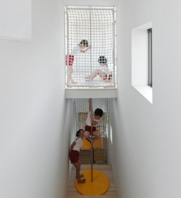
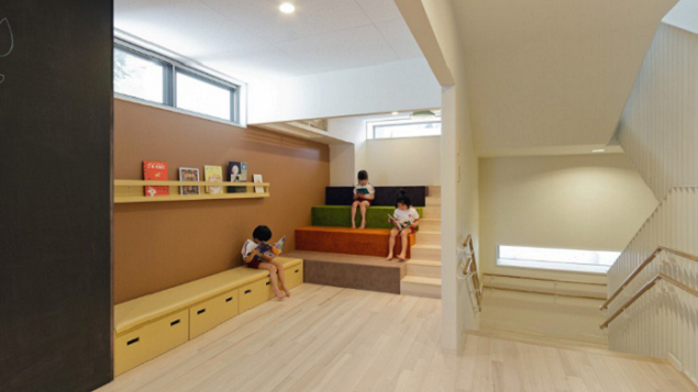
I like that this building has been designed purposefully for children, so everything is at the right height for them and all the areas have been made fun and exciting to keep them interested in everything.
http://www.archdaily.com/635225/ob-kindergarten-and-nursery-hibinosekkei-youji-no-shiro

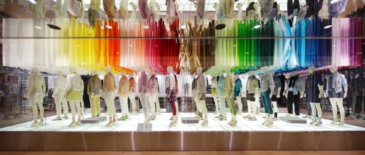
Emmanuelle Moureaux is a French architect living in Tokyo. Inspired by the layers and colors of Tokyo that built a complex depth and density on the street, and the Japanese traditional spatial elements like sliding screens, she has created the concept of shikiri, which literally means “dividing (creating) space with colors”. She uses colors as three-dimensional elements, like layers, in order to create spaces, not as a finishing touch applied on surfaces.
Her work is amazing! Here’s a few examples of her work…


I really like her use of colour and material
These pieces of her work has given me the idea to do a hanging maze type thing for my play area. To create a colourful, sensory experience for the children.

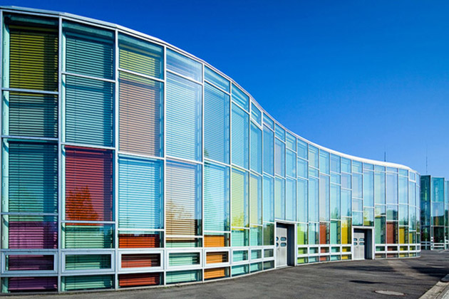
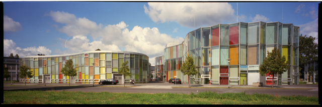
The Photonic Centre in Berlin is a glass building with coloured blinds that create the multicoloured facade that looks really awesome. I have been playing with the idea of coloured glass for a while but this offers an alternative to adding colour without it being a permanent feature. You could also experiment with lots of different colours.

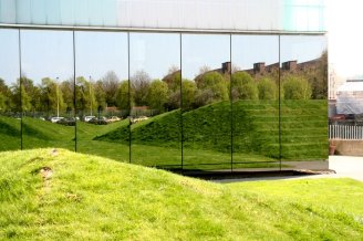
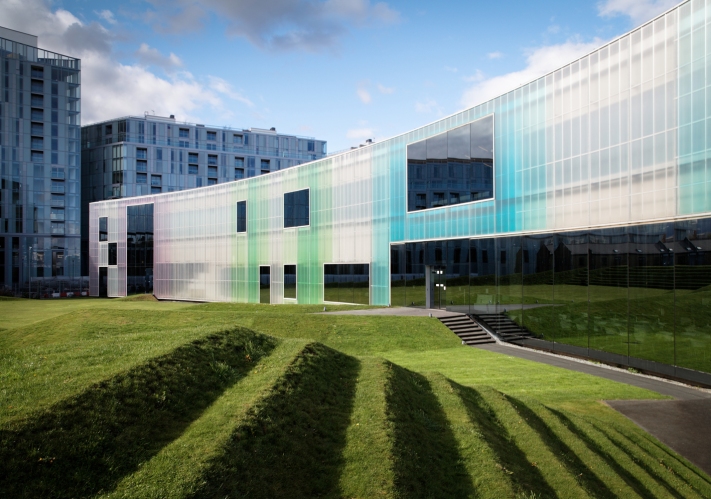
‘Trinity Laban Conservatoire of Music and Dance is the UK’s only conservatoire of music and contemporary dance. Leaders in music and contemporary dance education, we also provide exciting opportunities for the public to encounter dance and music, and access arts health programmes. The unequalled expertise and experience of our staff and our world class facilities are housed in landmark buildings.’ (http://www.trinitylaban.ac.uk/about-us)
I am looking at this building for its coloured polycarbonate building pictured below.
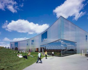
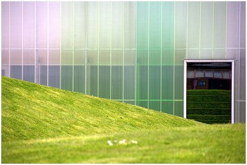
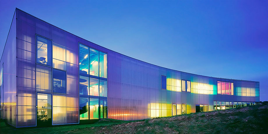
I was planning on using glass for my extension building but this looks beautiful and provides more privacy so I am going to consider using this instead.
Here’s a few photos of how this looks from the inside….
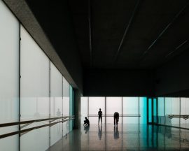
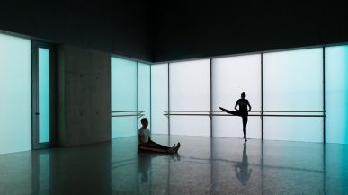
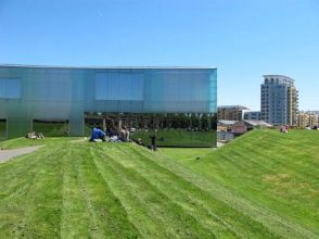
This building also has an amazing outdoor landscaped seating area for an outdoor theatre. I think this will be useful for the floor plans and levels of my floors in the play area spaces of my building.
First draft of my programme diagram.
Pink – Relax
Purple – Activities
Blue – Food
Green – Play
Orange – Admin
Yellow – Health
Pink – W.C
Red – Corridors
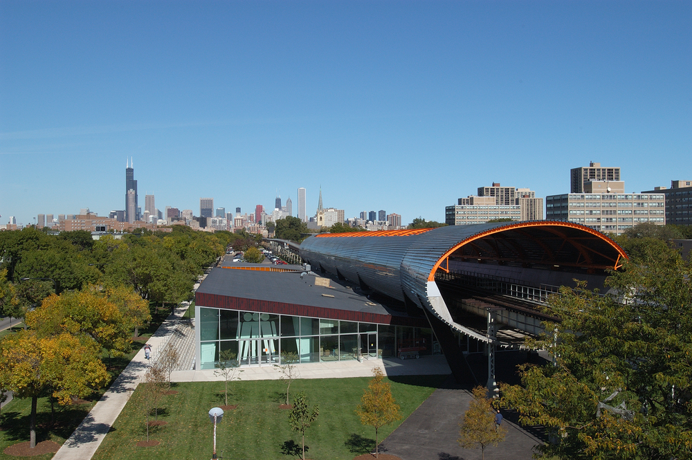
I looked into the McCormick Centre for the stair design inside.
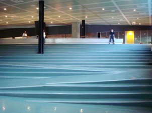
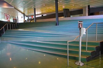
Wanting to use levels and angles in the design of my extension, I thought this was a good precedent. The use of angles makes this staircase look interesting and inventive. I hope to use something that achieves the same effect this gets in my work.
